Published: April 18, 2021
Updated: July 01, 2025 at 04:57PM
Overview
Welcome to my Basketball Season Data Analysis page. Here, you’ll find a collection of visualizations and data tables that provide insights into the current NBA season. All of the data come from basketball-reference.com, and the page is updated on a daily basis during the regular season and post season.
Trend Graphs of Cumulative Wins Over Time
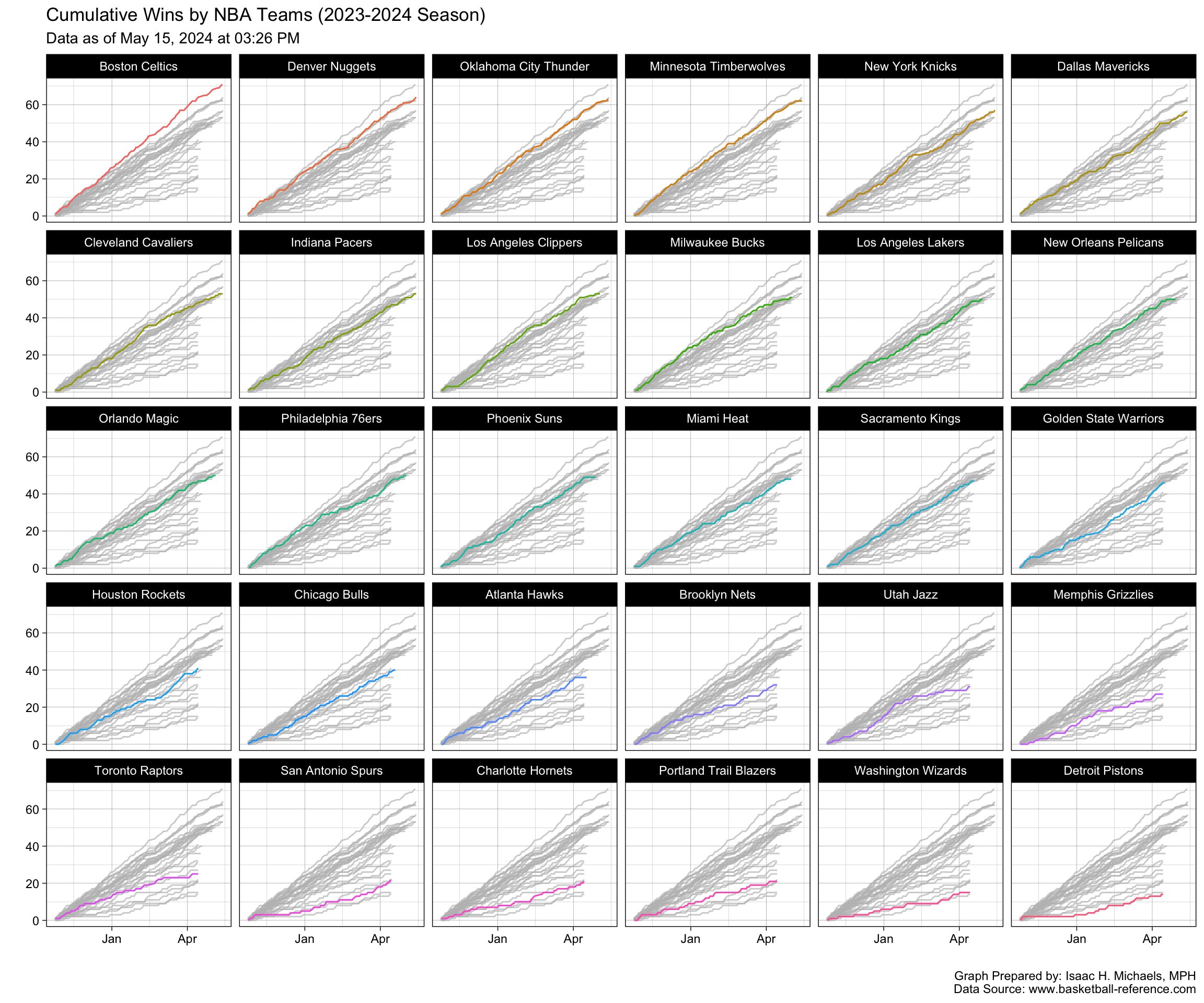
I’ve included trend graphs of cumulative wins over time, arrayed by team. These graphs allow you to see the overall trend in each team’s record over the course of the season, and get a sense of whether a team is on the rise or falling off.
Scatter Plots of Points Scored vs. Points Allowed
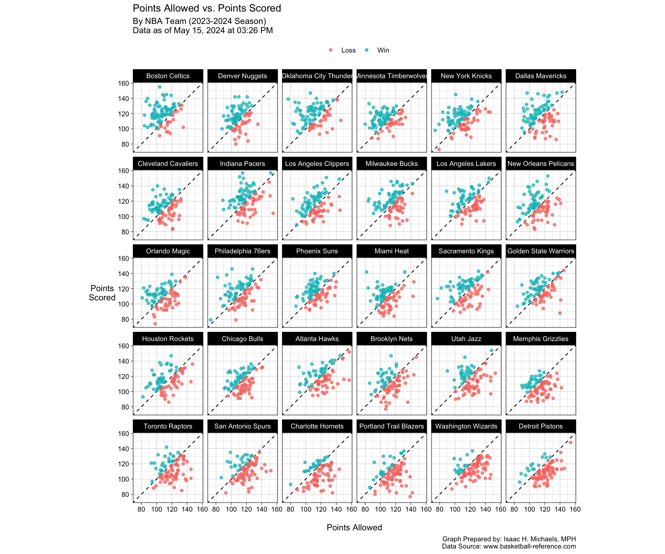
Another visualization I’ve included is a set of scatter plots of points scored vs. points allowed in each game of the season, arrayed by team. These plots allow you to see how each team is performing offensively and defensively, and get a sense of which teams are particularly strong in one area or the other.
Bar Graphs of Games Played by Point Differential
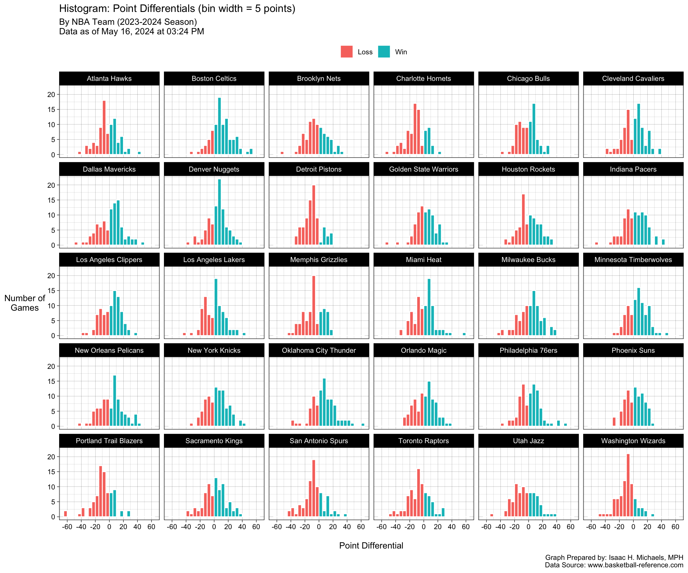
I’ve also included bar graphs that show the number of games played by each team, broken down by points differential.
Bar Graphs of Points Differential Over Time
In addition to the bar graphs of games played by points differential, I’ve also included bar graphs that show the points differential for each team over time. These graphs allow you to see how each team’s performance has evolved over the course of the season, and get a sense of whether a team is consistently strong or prone to fluctuations.
Data Tables with Choropleth Shading
Finally, I’ve included a data table that compares individual players’ per-game stats, with choropleth shading to highlight the best and worst performers in each category. These table allows you to see how each player stacks up against their peers, and get a sense of which players are having the most impact on their team’s performance.
I hope you find these visualizations and data tables helpful in understanding the current NBA season. Thank you for visiting the page.
Points Scored vs. Points Allowed

Graph Prepared By: Isaac H. Michaels, MPH
Data Source: www.basketball-reference.com
Point Differentials
Player Statistics
Per-Game Stats
Note: Table displays rows only for players who played in at least 10 games.
Table Prepared By: Isaac H. Michaels, MPH
Data Source: www.basketball-reference.com
G – Games
GS – Games Started
MP – Minutes Played Per Game
PTS – Points Per Game
FG – Field Goals Per Game
FGA – Field Goal Attempts Per Game
FG% – Field Goal Percentage
3P – 3-Point Field Goals Per Game
3PA – 3-Point Field Goal Attempts Per Game
3P% – 3-Point Field Goal Percentage
2P – 2-Point Field Goals Per Game
2PA – 2-Point Field Goal Attempts Per Game
2P% – 2-Point Field Goal Percentage
eFG% – Effective Field Goal Percentage
FT – Free Throws Per Game
FTA – Free Throw Attempts Per Game
FT% – Free Throw Percentage
ORB – Offensive Rebounds Per Game
DRB – Defensive Rebounds Per Game
TRB – Total Rebounds Per Game
AST – Assists Per Game
STL – Steals Per Game
BLK – Blocks Per Game
TOV – Turnovers Per Game
PF – Personal Fouls Per Game


