- Welcome
- Data Overview
- How to Use These Data
- Why Are These Data Important?
- What Do These Data Show?
- What Do These Data Not Show?
- Implications for Public Health Practice
- Executive Summary
- Laboratory-Confirmed Cases of Influenza in New York State
- Visits to the Emergency Department that have an Influenza Diagnosis, New York City
- Hospitalizations from the Emergency Department that have an Influenza Diagnosis, New York City
- Influenza Mortality
- Influenza Vaccination Coverage
Published: November 8, 2022
Updated: October 08, 2026 at 06:03PM
Welcome
Welcome to New York Flu Watch, a resource you can use to follow influenza activity across New York State and New York City in near real time. This page brings together multiple open data sources to give you a comprehensive view of laboratory-confirmed influenza cases, emergency department utilization, hospitalizations, mortality, and vaccination coverage. By drawing from statewide and city-level surveillance systems, you can explore how influenza patterns differ across regions, populations, and phases of the season. Whether you are making operational decisions, planning prevention efforts, or simply trying to stay informed, the analyses presented here are intended to help you interpret current trends with clarity and context.
Data Overview
You will find that the data presented on this page represent several complementary surveillance streams, each providing a different perspective on the burden and distribution of influenza. Laboratory-confirmed case data give you insight into virologically confirmed infections, while emergency department and hospitalization data highlight how many people are seeking care for influenza-related illness. Mortality data, drawn from federal vital statistics systems, show you how influenza contributes to severe outcomes across age groups and regions. Vaccination coverage data, collected through national surveys, allow you to assess how well communities are protected as the season unfolds. Together, these datasets form a layered picture of influenza activity, although each dataset has its own structure, strengths, and limitations.
How to Use These Data
You can refer to these data to understand where influenza activity is most prominent, how quickly it is increasing or decreasing, and which groups or geographic areas may be experiencing greater burden. By reviewing the maps, time trends, and age-stratified analyses, you can identify patterns that may warrant closer attention—such as early spikes in activity, regional disparities, or notable changes in healthcare use. These displays also help you compare the current season with historical patterns, an essential step in determining whether observed activity is typical or unusually elevated. Public health departments, hospital systems, and community organizations may find these outputs useful for situational awareness, resource planning, vaccination outreach, and communication with the public. Individuals can also use these data to make informed decisions about preventive behaviors, healthcare-seeking, and vaccination timing.
Why Are These Data Important?
Understanding influenza trends is crucial for protecting both individual and community health, and these data provide you with actionable insight into the timing, spread, and severity of each flu season. The data help you see when influenza begins circulating, how rapidly it grows, and which areas or groups experience higher levels of illness. These patterns support critical planning and response actions, such as reinforcing vaccination messaging, preparing healthcare facilities for increased demand, and identifying communities where additional outreach may be needed. Because influenza varies from year to year—and because vaccination uptake, population immunity, and circulating strains change over time—having timely and transparent data is essential for making informed policy and operational decisions. By following these indicators throughout the season, you can stay aware of emerging risks and understand how influenza is affecting New Yorkers in real time.
What Do These Data Show?
The figures and tables on this page show you how influenza is manifesting across multiple dimensions, including counts, rates, severity, and geographic variation. Laboratory-confirmed case data show where reported infections are occurring and how those patterns shift across weeks, regions, and influenza types. Emergency department visit and hospitalization data highlight the clinical burden of influenza-like illness on healthcare systems, an important marker of severity and system stress that may rise even when testing is incomplete. Mortality data show how influenza contributes to severe outcomes, allowing you to explore differences across age groups and regions. Vaccination coverage data give you a sense of how well-protected various populations may be, and whether coverage levels align with seasonal risk. Taken together, these outputs present a detailed and interconnected view of the influenza landscape.
What Do These Data Not Show?
Although these data provide valuable insights, they do not reflect the full extent of influenza activity in the population. Laboratory-confirmed cases capture only individuals who sought care, were tested, and received results that were reported to surveillance systems; many mild or moderate influenza infections occur outside of healthcare settings and are therefore not counted. Emergency department and hospitalization data reflect only the subset of people who became ill enough to seek urgent or inpatient care, so they do not represent all influenza-like illness in the community. Mortality data report deaths in which influenza or related conditions were identified on death certificates, but they do not capture all influenza-associated deaths, especially in cases where influenza was not tested for or recorded. Vaccination coverage data are based on survey responses and may be subject to recall error, nonresponse bias, or sampling variability. For these reasons, you should consider these data as highly useful indicators—but not complete measures—of influenza activity.
Implications for Public Health Practice
Using these data, you can better anticipate the needs of your community, guide prevention strategies, and strengthen preparedness for periods of increased respiratory illness. Trends in laboratory-confirmed cases and emergency department utilization can help you identify when activity is accelerating and when interventions such as vaccination messaging, testing reminders, or enhanced infection prevention practices may be most effective. Regional and age-specific analyses can help you target resources to populations or areas experiencing disproportionate impact, while vaccination coverage data can support efforts to reduce disparities in protection. Mortality patterns can inform high-level planning by highlighting groups that may be at increased risk for severe outcomes. By integrating these data into ongoing monitoring efforts, you can support timely public health action, promote community resilience, and enhance the overall response to influenza across New York State.
Executive Summary1
Date: October 08, 2026 Subject: Update on New York State Influenza Surveillance, Geographic Patterns, and Vaccine Coverage
The most recent laboratory-confirmed influenza data for the 2025-2026 season show a total of 445,545 cases across New York State, yielding an incidence rate of 2,227.45 per 100,000 residents. Longitudinal surveillance through May 23, 2026, illustrates a two-wave viral distribution, with Influenza A peaking early at 74,075 weekly cases on December 20, 2025. Subsequently, Influenza B cases rose to a peak of 11,810 during the week ending March 28, 2026, before declining to 1,150 cases by late May. Notably, holiday-period transmission at CDC Week 53 reached 36,555 Influenza A cases, which represents a substantial 993% relative increase, or an absolute difference of 33,212 cases, compared to the same week in the 2014-2015 season. This elevated mid-season volume may reflect altered population immunity profiles, though it could also indicate underlying changes in testing and reporting practices over the past decade.
Geographically, the state-level data demonstrate substantial variation in incidence rates during the early 2025-2026 season through October 4, 2025. Long Island and the Mid-Hudson region reported the highest regional incidence rates at 2,881.67 and 2,728.91 cases per 100,000 residents, respectively. At the county level, Putnam (3,749.44 per 100,000) and Oswego (3,343.20 per 100,000) recorded the highest rates statewide, which could indicate localized areas of elevated transmission. When evaluating New York City, a notable discrepancy emerges between the separate state and local data sources. The state dataset attributes 184,296 cumulative cases to New York City through October 4, 2025, whereas the city’s independent respiratory dashboard reports only 3,426 cumulative cases across all age groups through November 8, 2025. This divergence likely reflects methodological differences, such as variations in case definitions, data lag, or differing clinical inclusion criteria between the state and municipal reporting systems.
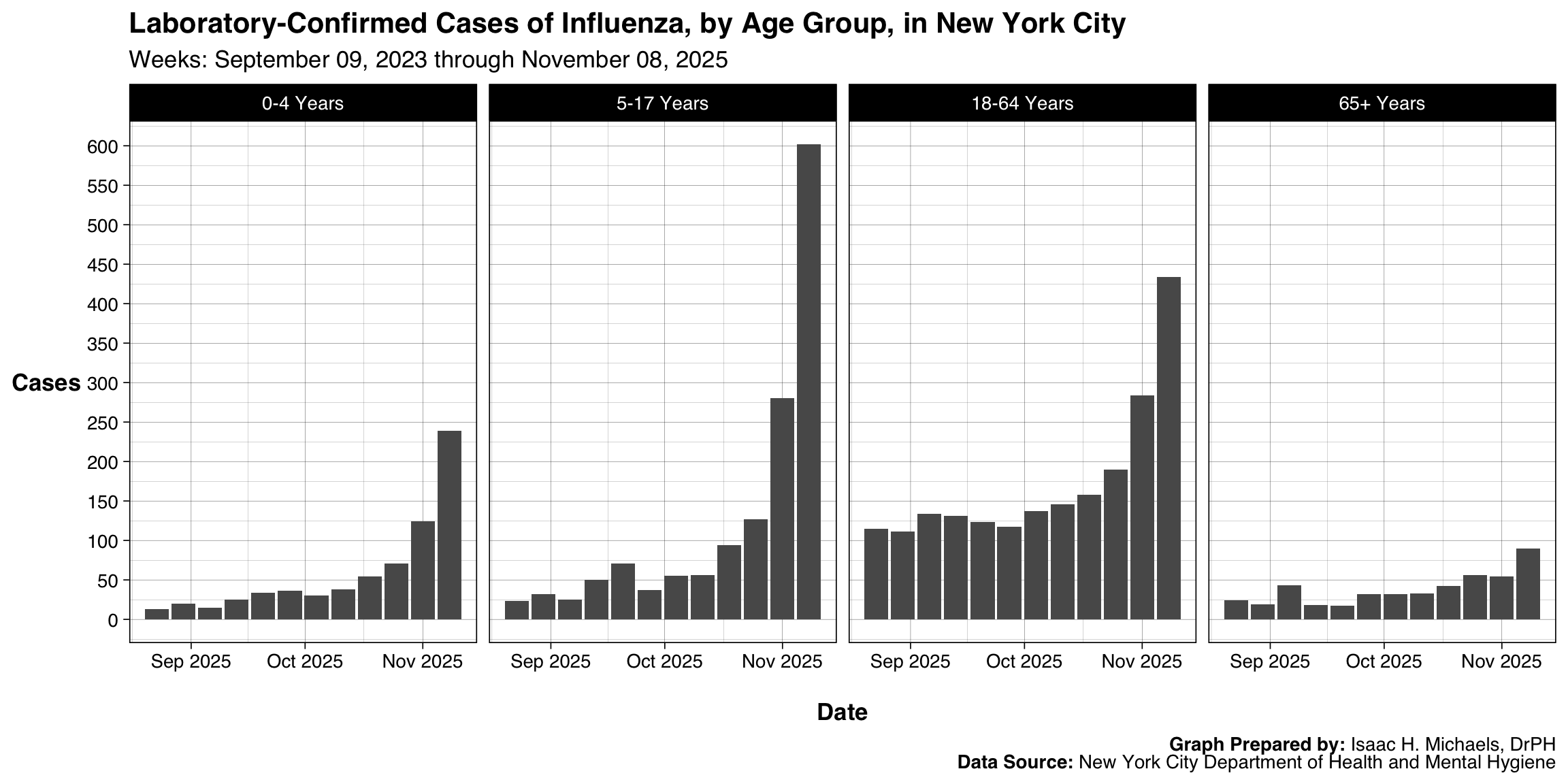
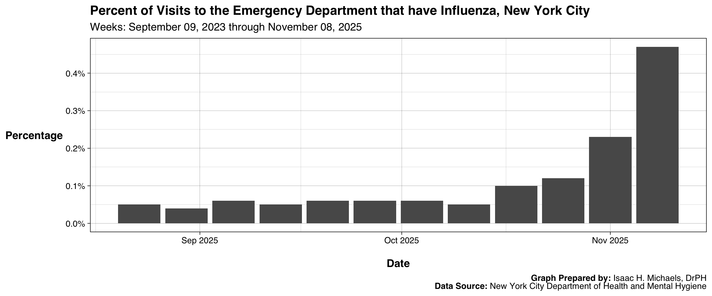
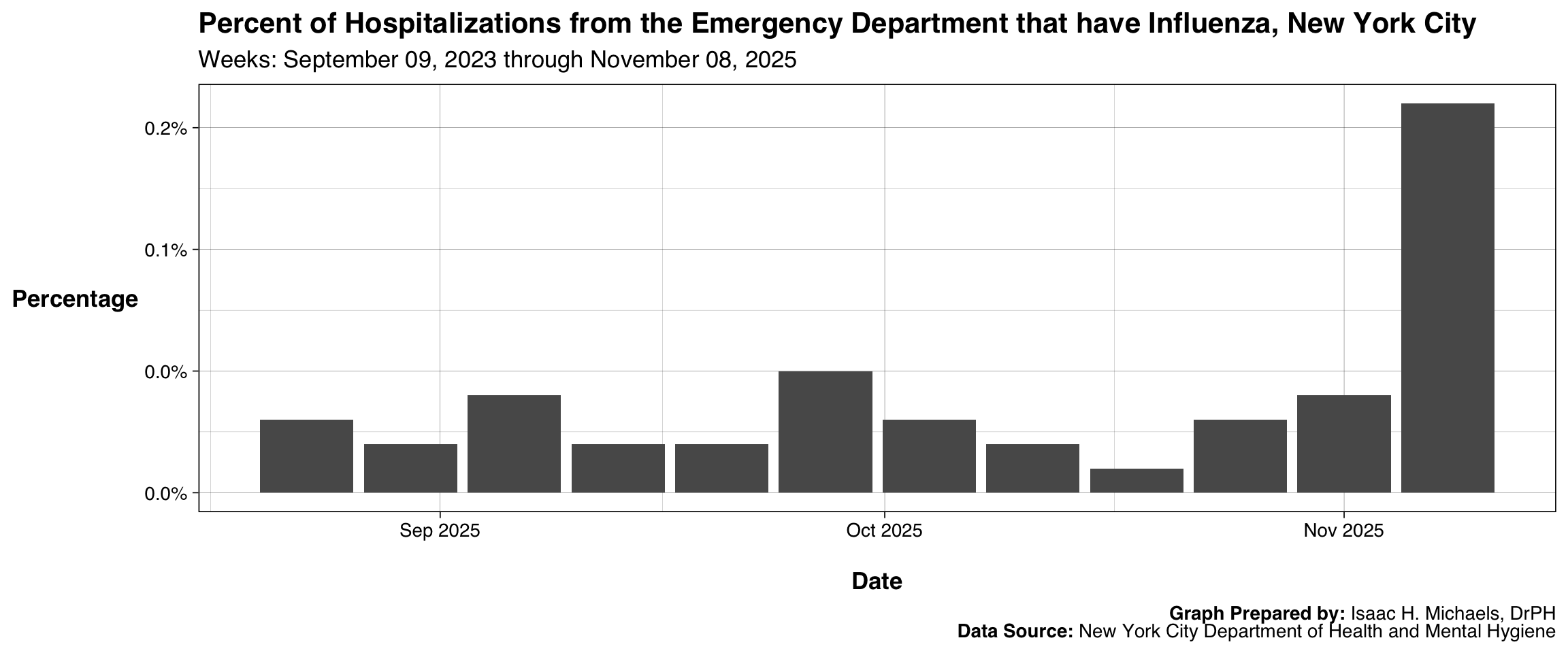
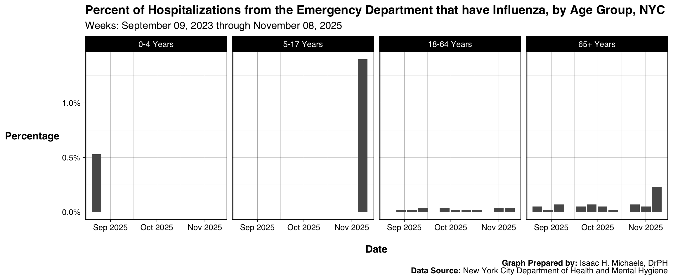
Within the municipal dataset through November 8, 2025, early-season syndromic surveillance indicators displayed consistent upward trajectories. The proportion of emergency department visits attributed to influenza rose from 0.06% on October 4 to 0.47% by November 8, representing an absolute increase of 0.41 percentage points and a relative increase of 683%. Over the same five-week period, the percentage of emergency department visits resulting in an influenza-related hospitalization increased from 0.03% to 0.16%, constituting a relative growth of 433%. Age stratification from these municipal data indicates that working-age adults (18-64 years) and school-aged children (5-17 years) comprise the majority of early-season cases, with 1,349 and 1,214 absolute cases, respectively. The higher case counts in these specific demographics may reflect elevated occupational and educational exposure networks, though further data are required to validate this hypothesis.
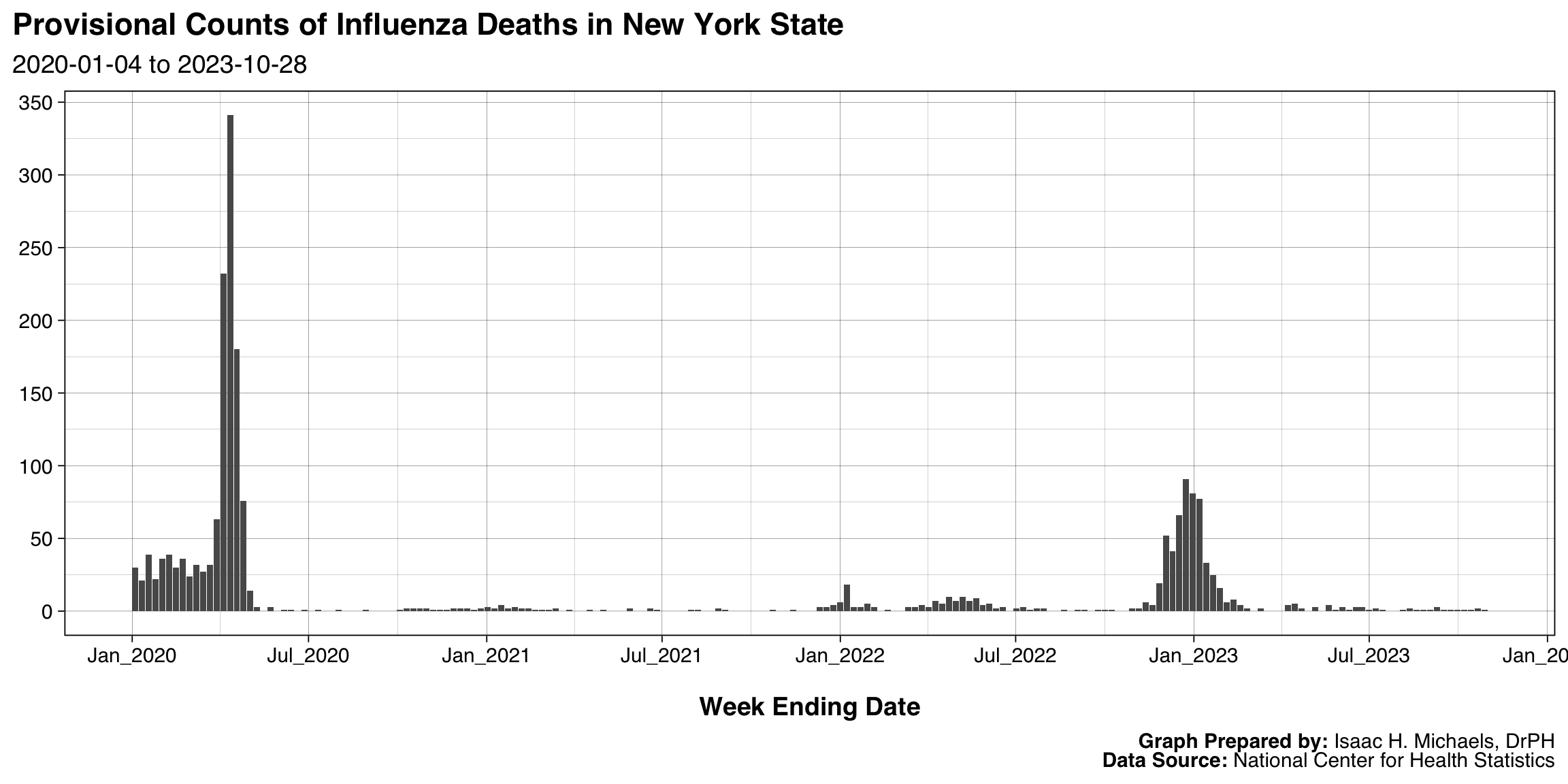
Early vaccine coverage estimates for October of the 2025-2026 season show a broad decline in uptake across all monitored age cohorts compared to the previous year. For example, coverage among children aged 6 months to 4 years dropped from 41.7% in 2024-2025 to 36.1% currently, representing an absolute decrease of 5.6 percentage points and a 13.4% relative decline. Similarly, adult coverage (18-49 years) decreased marginally from 15.8% to 15.7%, remaining the cohort with the lowest overall vaccine uptake. Regarding severe outcomes, the latest available state mortality data extend only through October 28, 2023, showing baseline inter-seasonal levels of 1 to 2 weekly deaths. Because these mortality data lag the current epidemiological season by over two years, they do not provide actionable insights into the severity of the 2025-2026 circulating strains, highlighting a persistent limitation in the integration of real-time surveillance across different public health databases.
Laboratory-Confirmed Cases of Influenza in New York State
Spatial Distribution
Incidence
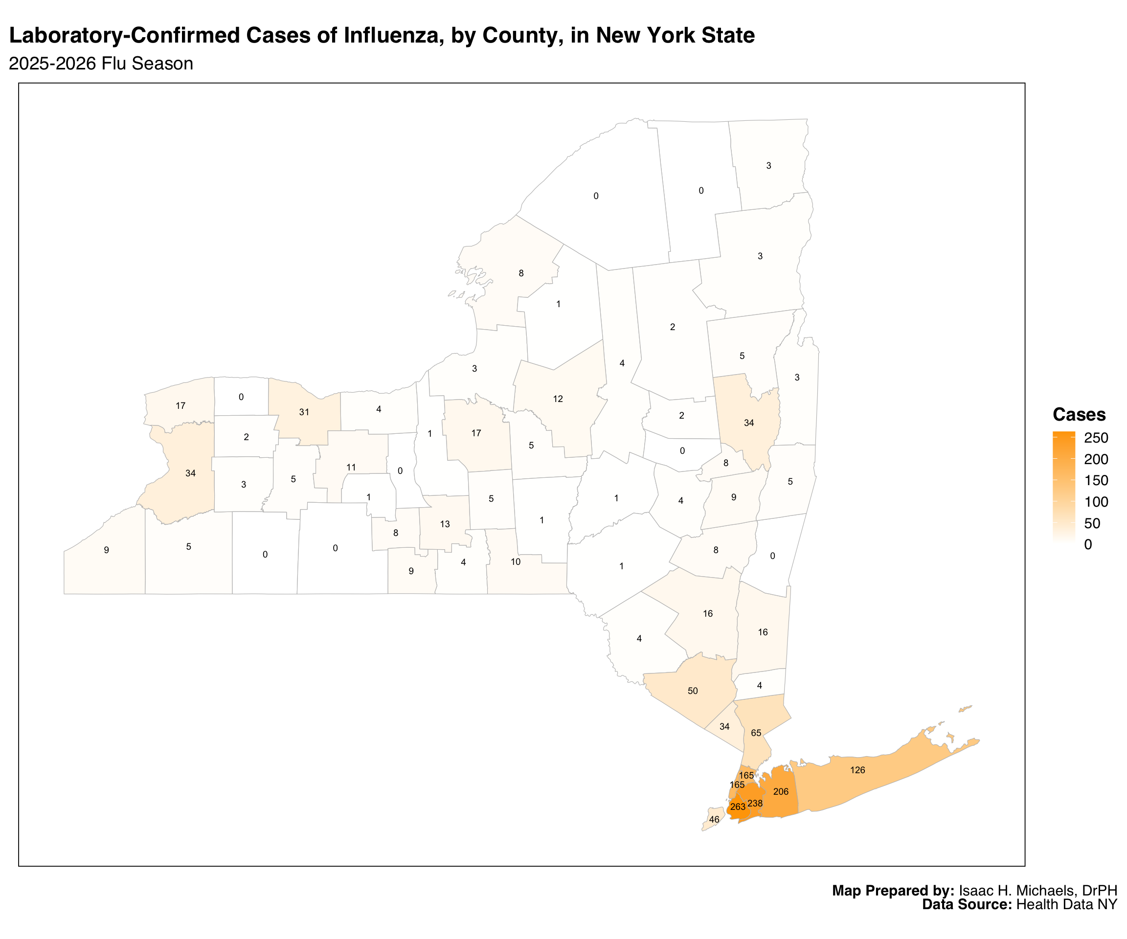
This map displays the number of laboratory-confirmed influenza cases reported in each county during the current flu season. Counties are shaded on a gradient from light to darker color according to the total number of cases, and each county is labeled with its exact count to support quick reference. The design helps highlight geographic differences in reported influenza activity, allowing readers to see where larger or smaller numbers of confirmed cases are concentrated across the state. Because the map reflects only laboratory-confirmed infections, it should be interpreted as an indicator of reported activity rather than a full measure of all influenza illness, which may include many untested or mild cases.
 Map Prepared By: Isaac H. Michaels, DrPH
Data Source: Health Data NY
Incidence Rate
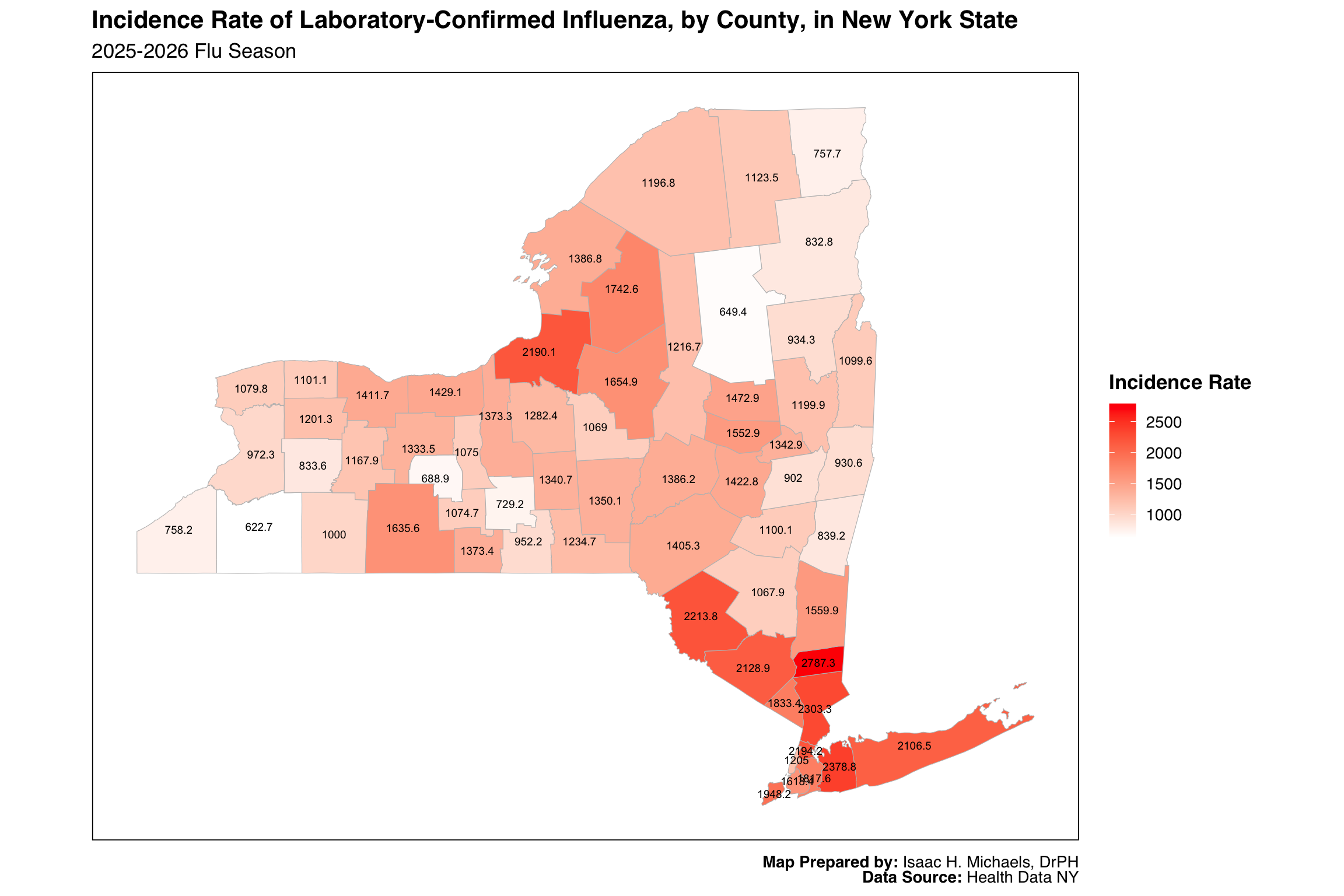
This map shows influenza incidence rates—cases per 100,000 residents—calculated for each county during the current flu season. By adjusting counts for population size, the map makes it possible to compare influenza activity more fairly across counties with very different population levels. A color gradient is used to display these rates, and each county is labeled with its rate to aid interpretation. This approach highlights where the burden of influenza is proportionally highest, which can support planning for local prevention, outreach, and preparedness efforts. As with all laboratory-based surveillance, these rates depend on testing practices and healthcare use, which may differ across regions.
 Map Prepared By: Isaac H. Michaels, DrPH
Data Source: Health Data NY
Longitudinal Trend
This figure shows weekly counts of laboratory-confirmed influenza cases in New York State, separated by influenza type and displayed across multiple seasons beginning in 2009. Each panel focuses on a single influenza type, allowing readers to follow long-term patterns in circulation for that type. Bars representing previous seasons are shown in one color, while bars for the current season appear in another, making it easy to distinguish this year’s activity from historical trends. Because the display spans more than a decade of surveillance, it provides context for understanding the timing, scale, and variability of influenza seasons. The interactive format includes optional tooltips showing the week ending date, influenza type, and reported case count, supporting deeper exploration of the data. As with the maps, these counts reflect laboratory-confirmed infections and do not capture all influenza illness.
Graph Prepared By: Isaac H. Michaels, DrPH
Data Source: Health Data NY
Seasonality
This figure displays weekly counts of laboratory-confirmed influenza cases across multiple seasons, separated into panels by influenza type. Each line represents a complete flu season, with the current season distinguished through color, alpha level, and point size to make it visually identifiable without obscuring historical context. By aligning all seasons on the CDC week calendar, the figure provides a consistent structure that supports comparisons of timing and relative magnitude across influenza types. The interactive tooltips provide season-specific details when a user hovers over any point, making it easier to connect visual elements with precise numeric values. Overall, the design helps public health practitioners quickly situate current-season activity within a long-term historical framework.
Graph Prepared By: Isaac H. Michaels, DrPH
Data Source: Health Data NY
By Region
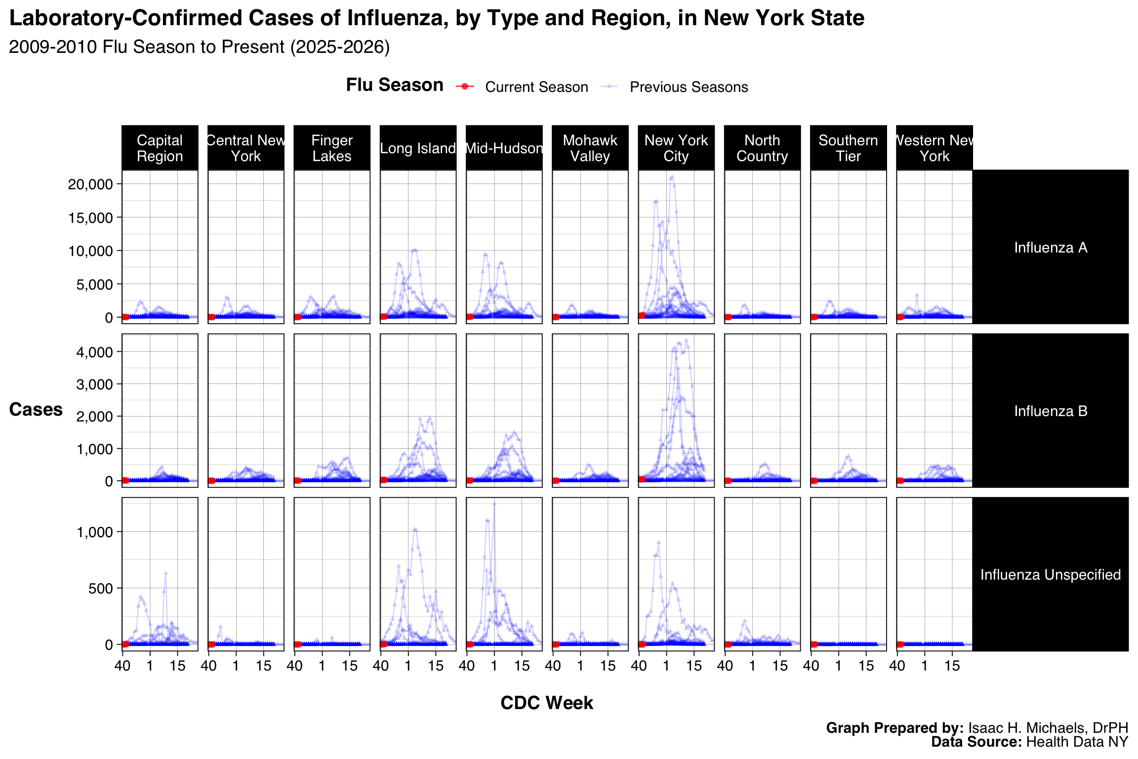
This graphic displays influenza case counts across CDC weeks, separated simultaneously by region and influenza type. Organizing the output into a grid allows each region to be read horizontally while influenza types appear in vertical groupings, helping users navigate spatial and virologic differences without mixing scales. Visual distinctions such as color, alpha, and point size differentiate the current season from previous seasons while avoiding clutter in panels that contain many overlapping lines. Axis limits are allowed to vary independently across panels so that smaller regions and less common influenza types are not visually compressed. This structure is useful for identifying regional operational needs, ensuring that quieter panels remain interpretable and that areas with higher activity are not minimized by statewide scaling.
 Graph Prepared By: Isaac H. Michaels, DrPH
Data Source: Health Data NY
Regions include the following counties:
Capital Region: Albany, Columbia, Greene, Saratoga, Schenectady, Rensselaer, Warren, Washington
Central New York: Cayuga, Cortland, Madison, Onondaga, Oswego
Finger Lakes: Genesee, Livingston, Monroe, Ontario, Orleans, Seneca, Wayne, Wyoming, Yates
Long Island: Nassau, Suffolk
Mid-Hudson: Dutchess, Orange, Putnam, Rockland, Sullivan, Ulster, Westchester
Mohawk Valley: Fulton, Herkimer, Montgomery, Oneida, Otsego, Schoharie
New York City: Bronx, Kings, New York, Richmond, Queens
North Country: Clinton, Essex, Franklin, Hamilton, Jefferson, Lewis, St. Lawrence
Southern Tier: Broome, Chemung, Chenango, Delaware, Schuyler, Steuben, Tioga, Tompkins
Western New York: Allegany, Cattaraugus, Chautauqua, Erie, Niagara
Cases in New York City, by Age Group
This figure presents weekly case counts for New York City, organized by age group in a single-row grid. Using bars rather than lines emphasizes absolute counts and the week-to-week shifts commonly reviewed in surveillance operations. Placing each age group in its own panel prevents larger age groups from dominating the scale and helps readers evaluate patterns within each demographic category. Aligning the x-axes allows for straightforward temporal comparison across groups without requiring them to share a single y-axis. The design supports age-specific operational planning and communication by presenting counts in a format that can be scanned quickly.
 Graph Prepared By: Isaac H. Michaels, DrPH
Data Source: New York City Department of Health and Mental Hygiene
County-Level Data
This table brings together county-level influenza indicators in a format that supports both detailed review and high-level comparison. Columns include counts, incidence rates, and population denominators, along with sparklines that summarize current and historical trends in a compressed, visual form. Color shading highlights counties with higher case counts or rates, while grouped sections under tab spanners organize the table into meaningful conceptual blocks such as cumulative incidence and trend history. Sparklines are particularly useful for spotting unusual seasonal trajectories that might not be immediately apparent from the numeric fields alone. The table’s structure enables users to explore geographic variation efficiently while retaining access to underlying numerical detail.
| Laboratory-Confirmed Influenza in New York State | |||||||||
| Data through week ending: May 23, 2026 | |||||||||
| County |
Current Season Cumulative Incidence |
Current Season Incidence Rate |
Trends |
||||||
|---|---|---|---|---|---|---|---|---|---|
| Influenza A | Influenza B | Influenza Unspecified | Total Cases | Population | Total Cases per 100,000 Population | Current Season (2025-2026) | Previous Seasons (2009-2010 through 2024-2025) | ||
| Capital Region | Albany | 2,915 | 1,157 | 26 | 4,098 | 321,225 | 1,275.74 | ||
| Columbia | 539 | 243 | 5 | 787 | 60,168 | 1,308.00 | |||
| Greene | 583 | 208 | 2 | 793 | 47,238 | 1,678.73 | |||
| Rensselaer | 1,542 | 782 | 18 | 2,342 | 160,510 | 1,459.10 | |||
| Saratoga | 2,355 | 1,708 | 17 | 4,080 | 241,343 | 1,690.54 | |||
| Schenectady | 2,091 | 983 | 14 | 3,088 | 162,581 | 1,899.36 | |||
| Warren | 639 | 364 | 4 | 1,007 | 65,020 | 1,548.75 | |||
| Washington | 604 | 346 | 0 | 950 | 59,353 | 1,600.59 | |||
| Central New York | Cayuga | 1,077 | 437 | 13 | 1,527 | 74,365 | 2,053.39 | ||
| Cortland | 667 | 547 | 0 | 1,214 | 45,850 | 2,647.76 | |||
| Madison | 840 | 620 | 4 | 1,464 | 67,120 | 2,181.17 | |||
| Onondaga | 6,483 | 3,975 | 7 | 10,465 | 466,584 | 2,242.90 | |||
| Oswego | 2,813 | 1,151 | 0 | 3,964 | 118,569 | 3,343.20 | |||
| Finger Lakes | Genesee | 704 | 235 | 0 | 939 | 58,416 | 1,607.44 | ||
| Livingston | 791 | 157 | 0 | 948 | 61,438 | 1,543.02 | |||
| Monroe | 11,332 | 3,436 | 0 | 14,768 | 750,506 | 1,967.74 | |||
| Ontario | 1,610 | 592 | 0 | 2,202 | 113,130 | 1,946.43 | |||
| Orleans | 454 | 127 | 0 | 581 | 39,825 | 1,458.88 | |||
| Seneca | 396 | 72 | 0 | 468 | 32,883 | 1,423.23 | |||
| Wayne | 1,412 | 348 | 0 | 1,760 | 91,250 | 1,928.77 | |||
| Wyoming | 373 | 142 | 0 | 515 | 39,741 | 1,295.89 | |||
| Yates | 207 | 71 | 0 | 278 | 24,547 | 1,132.52 | |||
| Long Island | Nassau | 33,144 | 8,920 | 560 | 42,624 | 1,398,939 | 3,046.88 | ||
| Suffolk | 32,275 | 9,096 | 871 | 42,242 | 1,546,090 | 2,732.18 | |||
| Mid-Hudson | Dutchess | 4,803 | 1,407 | 192 | 6,402 | 300,708 | 2,128.98 | ||
| Orange | 9,372 | 2,348 | 12 | 11,732 | 417,669 | 2,808.92 | |||
| Putnam | 2,770 | 885 | 58 | 3,713 | 99,028 | 3,749.44 | |||
| Rockland | 6,590 | 1,561 | 14 | 8,165 | 357,397 | 2,284.57 | |||
| Sullivan | 1,863 | 311 | 5 | 2,179 | 80,586 | 2,703.94 | |||
| Ulster | 2,047 | 933 | 85 | 3,065 | 183,330 | 1,671.85 | |||
| Westchester | 23,477 | 7,290 | 957 | 31,724 | 1,015,743 | 3,123.23 | |||
| Mohawk Valley | Fulton | 804 | 367 | 0 | 1,171 | 52,216 | 2,242.61 | ||
| Herkimer | 851 | 556 | 0 | 1,407 | 59,219 | 2,375.93 | |||
| Montgomery | 810 | 380 | 0 | 1,190 | 50,046 | 2,377.81 | |||
| Oneida | 4,159 | 1,612 | 2 | 5,773 | 226,392 | 2,550.00 | |||
| Otsego | 935 | 320 | 0 | 1,255 | 60,589 | 2,071.33 | |||
| Schoharie | 453 | 268 | 0 | 721 | 30,176 | 2,389.32 | |||
| New York City | Bronx | 31,033 | 7,779 | 28 | 38,840 | 1,406,332 | 2,761.79 | ||
| Kings | 43,594 | 9,416 | 91 | 53,101 | 2,653,963 | 2,000.82 | |||
| New York | 21,024 | 6,182 | 60 | 27,266 | 1,664,862 | 1,637.73 | |||
| Queens | 42,813 | 9,777 | 279 | 52,869 | 2,358,182 | 2,241.94 | |||
| Richmond | 9,653 | 2,271 | 296 | 12,220 | 501,290 | 2,437.71 | |||
| North Country | Clinton | 635 | 218 | 0 | 853 | 78,138 | 1,091.66 | ||
| Essex | 350 | 107 | 1 | 458 | 36,438 | 1,256.93 | |||
| Franklin | 575 | 174 | 0 | 749 | 46,500 | 1,610.75 | |||
| Hamilton | 40 | 14 | 0 | 54 | 5,006 | 1,078.71 | |||
| Jefferson | 1,727 | 568 | 2 | 2,297 | 111,540 | 2,059.35 | |||
| Lewis | 499 | 175 | 0 | 674 | 26,479 | 2,545.41 | |||
| St Lawrence | 1,337 | 230 | 0 | 1,567 | 105,488 | 1,485.48 | |||
| Southern Tier | Broome | 2,724 | 988 | 0 | 3,712 | 195,736 | 1,896.43 | ||
| Chemung | 1,343 | 447 | 0 | 1,790 | 80,415 | 2,225.95 | |||
| Chenango | 700 | 341 | 0 | 1,041 | 45,715 | 2,277.15 | |||
| Delaware | 655 | 227 | 0 | 882 | 44,305 | 1,990.75 | |||
| Schuyler | 221 | 59 | 0 | 280 | 16,924 | 1,654.46 | |||
| Steuben | 1,666 | 466 | 0 | 2,132 | 91,855 | 2,321.05 | |||
| Tioga | 568 | 311 | 0 | 879 | 47,453 | 1,852.36 | |||
| Tompkins | 1,044 | 454 | 1 | 1,499 | 104,047 | 1,440.70 | |||
| Western New York | Allegany | 538 | 299 | 0 | 837 | 46,800 | 1,788.46 | ||
| Cattaraugus | 608 | 412 | 0 | 1,020 | 75,390 | 1,352.96 | |||
| Chautauqua | 1,463 | 621 | 2 | 2,086 | 124,126 | 1,680.55 | |||
| Erie | 9,464 | 3,994 | 4 | 13,462 | 946,741 | 1,421.93 | |||
| Niagara | 2,374 | 1,002 | 0 | 3,376 | 208,912 | 1,615.99 | |||
| Data as of: October 08, 2026 | |||||||||
Table Prepared By: Isaac H. Michaels, DrPH
Data Source: Health Data NY
Visits to the Emergency Department that have an Influenza Diagnosis, New York City
Overall
This graphic uses bars to show the proportion of emergency department visits identified as influenza over time. Presenting percentages rather than counts aligns the output with situational awareness needs, given that ED volumes fluctuate independently of influenza activity. The consistent date axis allows users to track changes across the observation window without scrolling through multiple displays. The bar format highlights peaks and troughs clearly and helps users understand when influenza contributes to a larger share of ED visits. This structure is appropriate for hospital operations and incident command, where proportional measures often guide staffing and resource decisions.
 Graph Prepared By: Isaac H. Michaels, DrPH
Data Source: New York City Department of Health and Mental Hygiene
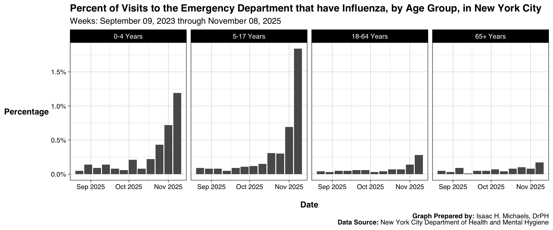
By Age Group
This output extends the previous figure by disaggregating influenza-related ED visit percentages into age-specific panels. Separate facets prevent any one age group from dominating the scale and allow each demographic category to be evaluated on its own terms. Because each panel shares the same date axis, users can compare timing and magnitude across groups without forcing them onto a single shared y-axis. This design highlights demographic differences that may be relevant for outreach, messaging, or pediatric versus adult capacity planning. The consistent structure also ensures that new weekly data integrate seamlessly into the long-term view.
 Graph Prepared By: Isaac H. Michaels, DrPH
Data Source: New York City Department of Health and Mental Hygiene
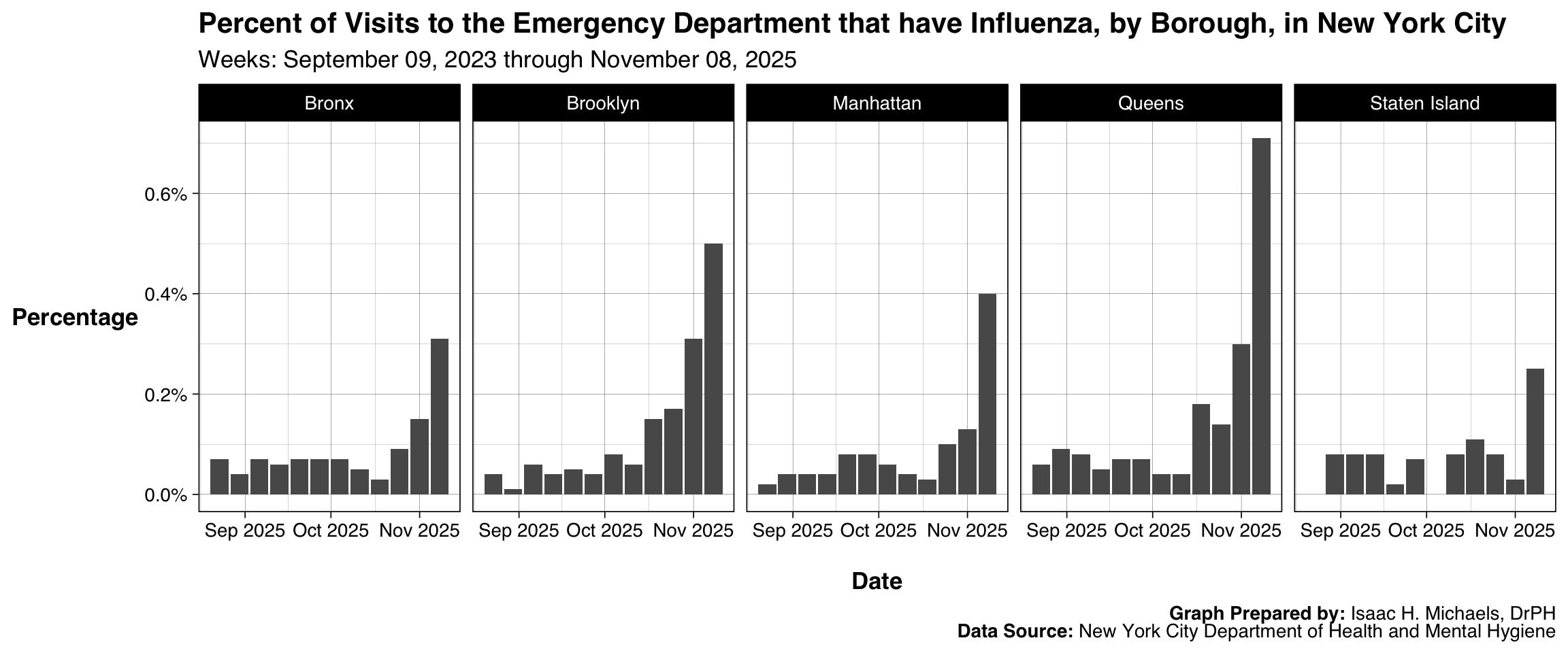
By Borough
This chart follows the same bar-based design but organizes results by borough to highlight differences in geographic distribution within the city. Each panel represents a single borough, enabling local context to be examined without the confounding effects of borough population size. Since the panels are displayed side-by-side, users can compare general patterns while retaining the ability to focus on any one borough’s operational profile. Presenting percentages ensures compatibility with borough-level ED utilization patterns, which can differ substantially. This layout supports planning efforts that require borough-level granularity.
 Graph Prepared By: Isaac H. Michaels, DrPH
Data Source: New York City Department of Health and Mental Hygiene
Hospitalizations from the Emergency Department that have an Influenza Diagnosis, New York City
Overall
This figure reports the proportion of emergency department visits that result in hospitalization with influenza as the identified condition. Using a bar format emphasizes weekly shifts in the metric and the relative burden influenza places on inpatient services. Because hospitalizations represent a downstream outcome of ED activity, displaying the values over time supports assessments of severity and healthcare system impact. The consistent date axis ensures interpretability across updates, while the uncluttered single-panel layout provides a clear view of trends for decision-making.
 Graph Prepared By: Isaac H. Michaels, DrPH
Data Source: New York City Department of Health and Mental Hygiene
By Age Group
This visualization applies the previous measure to age-specific subpopulations. Organizing the figure as a set of facets ensures that the hospitalization percentages for each age group are not visually dominated by other demographic categories. The structure allows users to compare the relative burden among children, adults, and older adults using shared time points across the panels. Presenting the information as a percentage rather than a count also aligns it with operational concerns about severity rather than testing volume. This format is helpful for age-focused clinical guidance and capacity planning.
 Graph Prepared By: Isaac H. Michaels, DrPH
Data Source: New York City Department of Health and Mental Hygiene
By Borough
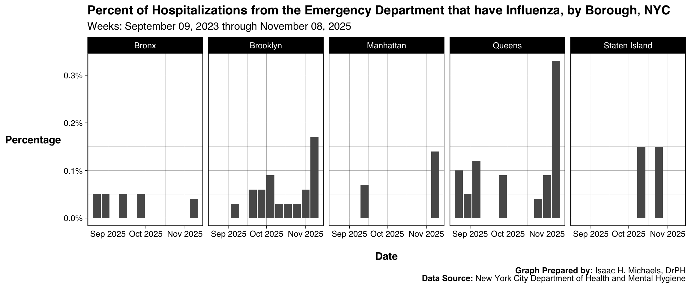
This graphic presents the borough-specific percentages of ED visits resulting in hospitalization due to influenza. The faceted layout separates boroughs into individual panels, giving each geographic unit a consistent visual space. This structure makes it easier to observe how hospitalization proportions differ across boroughs without forcing them onto a unified scale that might distort local patterns. The bar format ensures that shifts in relative burden are noticeable at a glance. The design is well suited for borough-level preparedness and situational awareness reporting.
 Graph Prepared By: Isaac H. Michaels, DrPH
Data Source: New York City Department of Health and Mental Hygiene
Influenza Mortality
Overall
This chart displays weekly provisional counts of influenza deaths in New York State. Using bars creates a clear delineation between weeks and supports rapid identification of changes in mortality burden over time. The single statewide panel keeps the focus on aggregate impact rather than regional distribution. Presenting the measure on a consistent weekly axis ensures that new data integrate smoothly and the overall structure remains stable across reporting periods. The design is appropriate for communicating mortality burden to both professional audiences and the public.
 Graph Prepared By: Isaac H. Michaels, DrPH
Data Source: National Center for Health Statistics
By Region
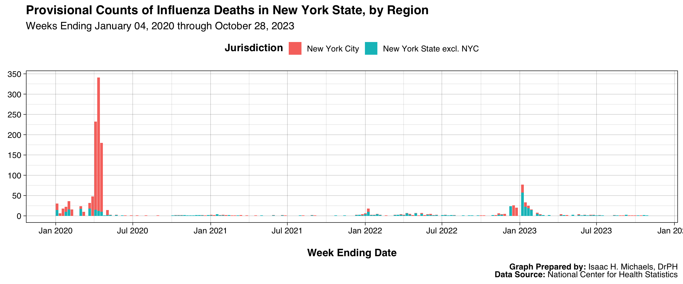
This figure expands statewide mortality data by stacking regions within each weekly bar. Stacking preserves the total count for each week while showing how mortality is distributed across regions, making it suitable for reviewing the relative contribution of different areas. Because the y-axis remains consistent across the entire display, the figure maintains interpretability despite regional variation. The legend placed at the top improves readability and supports quick identification of regional contributions. This approach helps users understand how mortality burden shifts geographically over time.
 Graph Prepared By: Isaac H. Michaels, DrPH
Data Source: National Center for Health Statistics
By Age Group
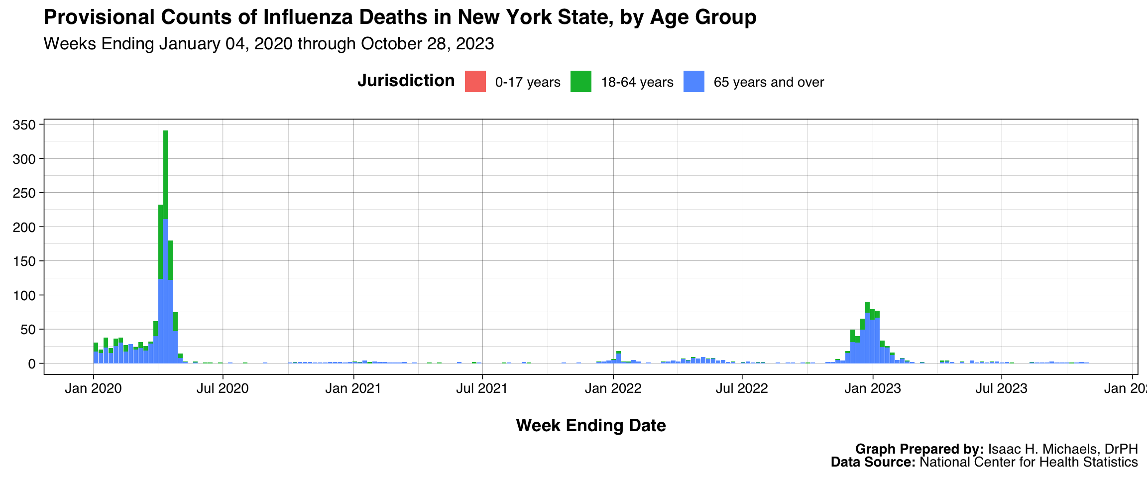
This chart organizes provisional mortality counts by age group using a stacked format. The design preserves total weekly counts while showing how deaths are distributed across demographic categories. Using a shared weekly time axis ensures comparability across reporting periods and simplifies interpretation of the evolving burden. The stacked arrangement is particularly valuable for highlighting which age groups contribute most to mortality at different points in the season. This presentation supports age-focused prevention and communication efforts.
 Graph Prepared By: Isaac H. Michaels, DrPH
Data Source: National Center for Health Statistics
Influenza Vaccination Coverage
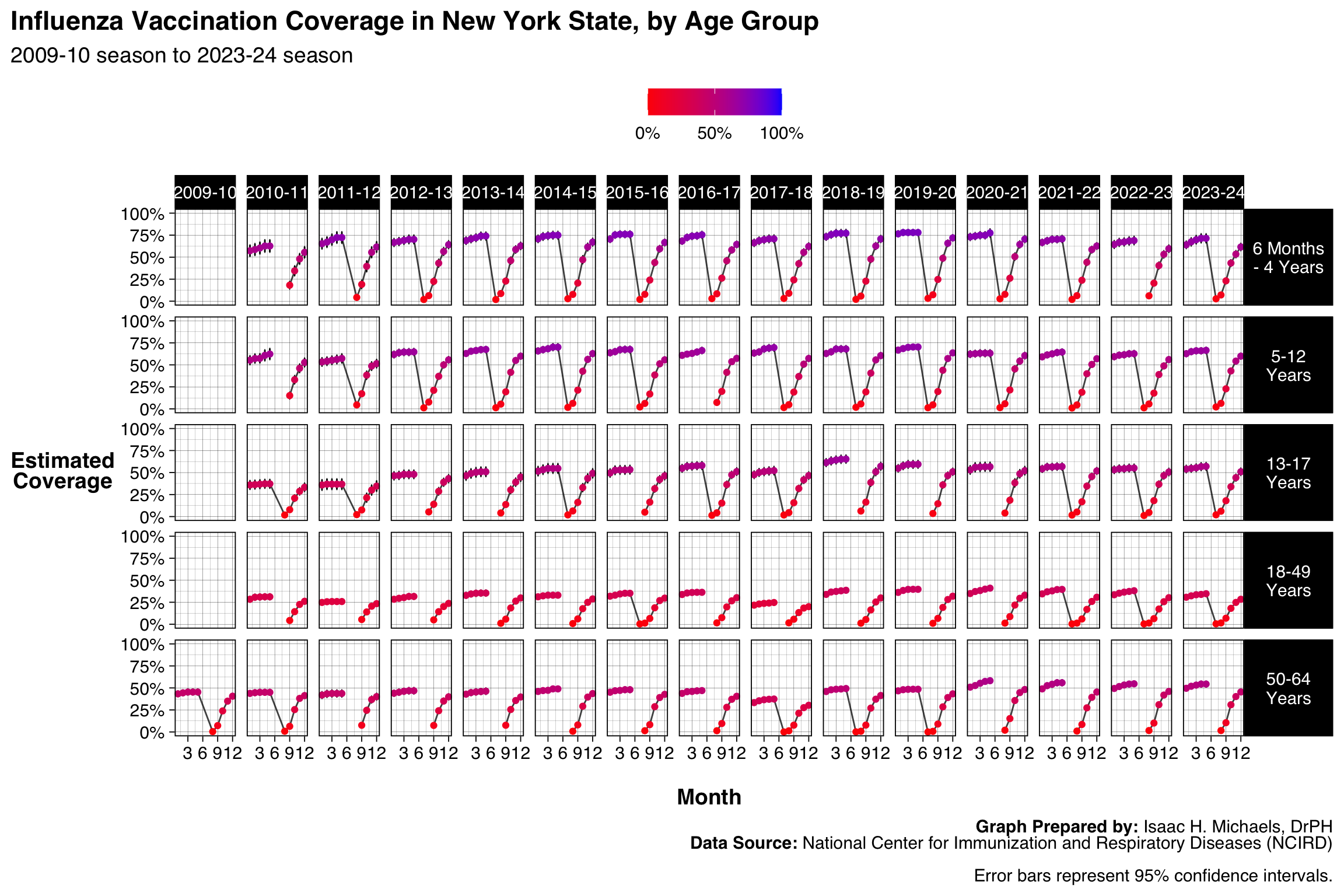
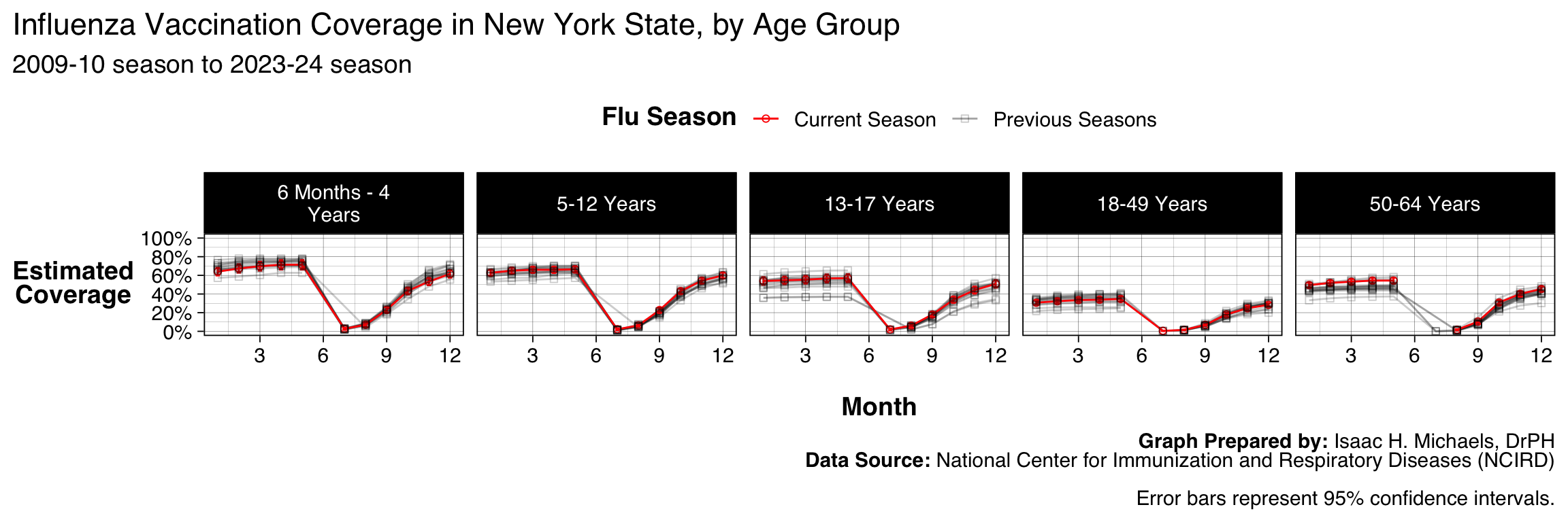
This display shows vaccination coverage estimates across months for several influenza seasons, separated by age group. Lines represent estimated monthly coverage, while error bars display 95% confidence intervals to communicate uncertainty inherent in survey-based estimates. Faceting places each age group in its own row and each season in its own column, creating a matrix that helps users examine how coverage evolves within and across seasons. The consistent y-axis scaling from 0 to 100% ensures that trends remain interpretable even when estimates vary substantially by age group. Color gradients tied to coverage values allow users to quickly locate higher and lower coverage points without overshadowing the error bars. This structure is particularly helpful for assessing program performance and identifying age groups that may benefit from targeted vaccination campaigns.
New York State
 Graph Prepared By: Isaac H. Michaels, DrPH
Data Source: National Center for Immunization and Respiratory Diseases (NCIRD)
__Graph Prepared By:__ [Isaac H. Michaels, DrPH](https://www.researchgate.net/profile/Isaac_Michaels) Data Source: National Center for Immunization and Respiratory Diseases (NCIRD)
New York City
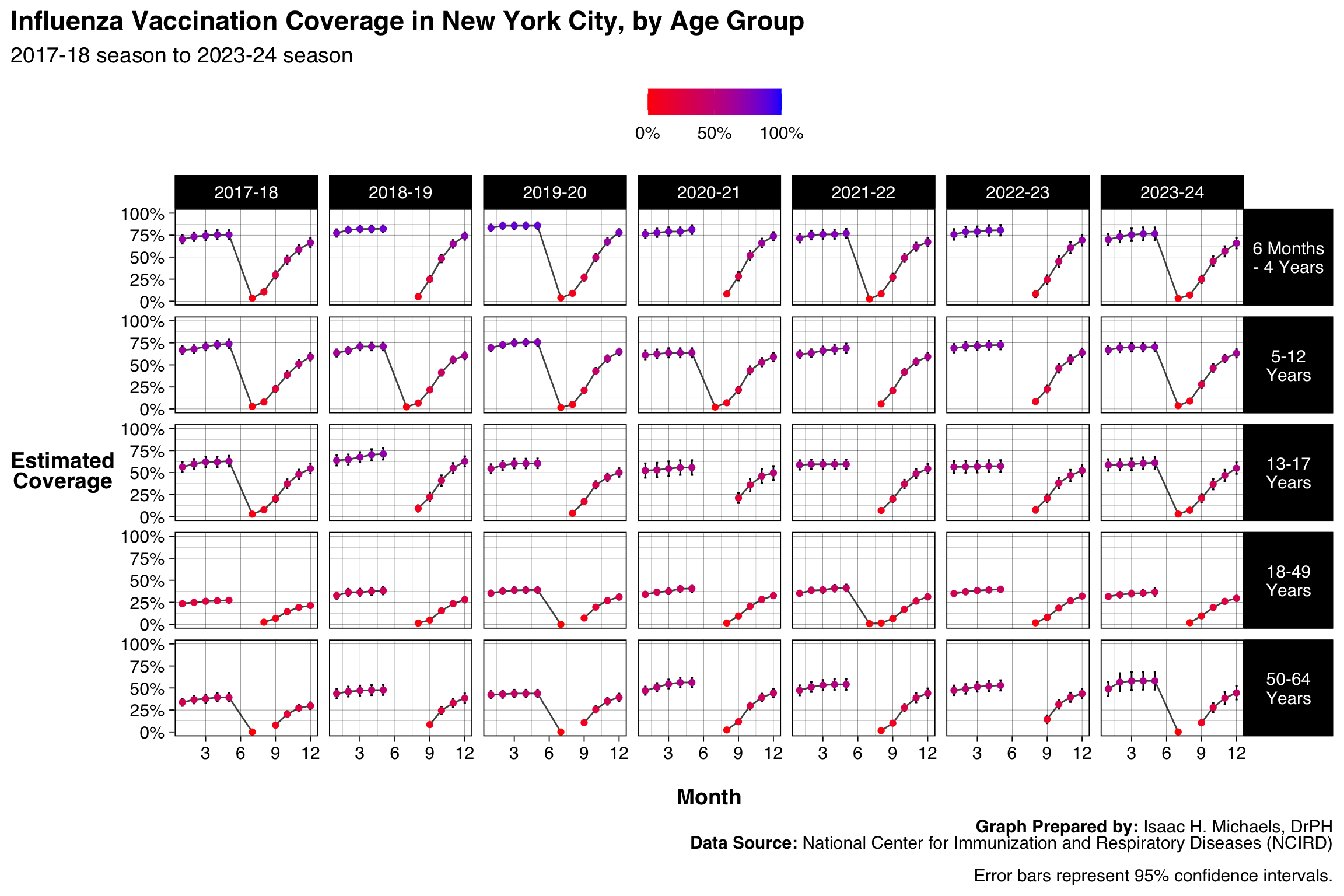 Graph Prepared By: Isaac H. Michaels, DrPH
Data Source: National Center for Immunization and Respiratory Diseases (NCIRD)
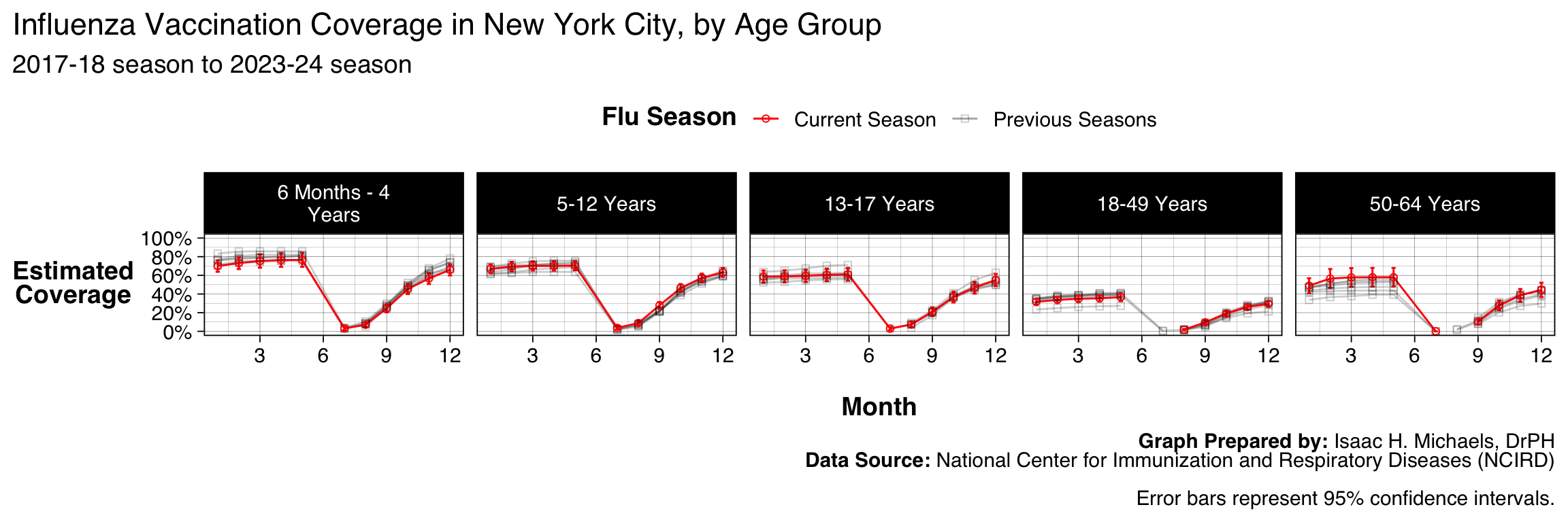
__Graph Prepared By:__ [Isaac H. Michaels, DrPH](https://www.researchgate.net/profile/Isaac_Michaels) Data Source: National Center for Immunization and Respiratory Diseases (NCIRD)
New York State excluding NYC
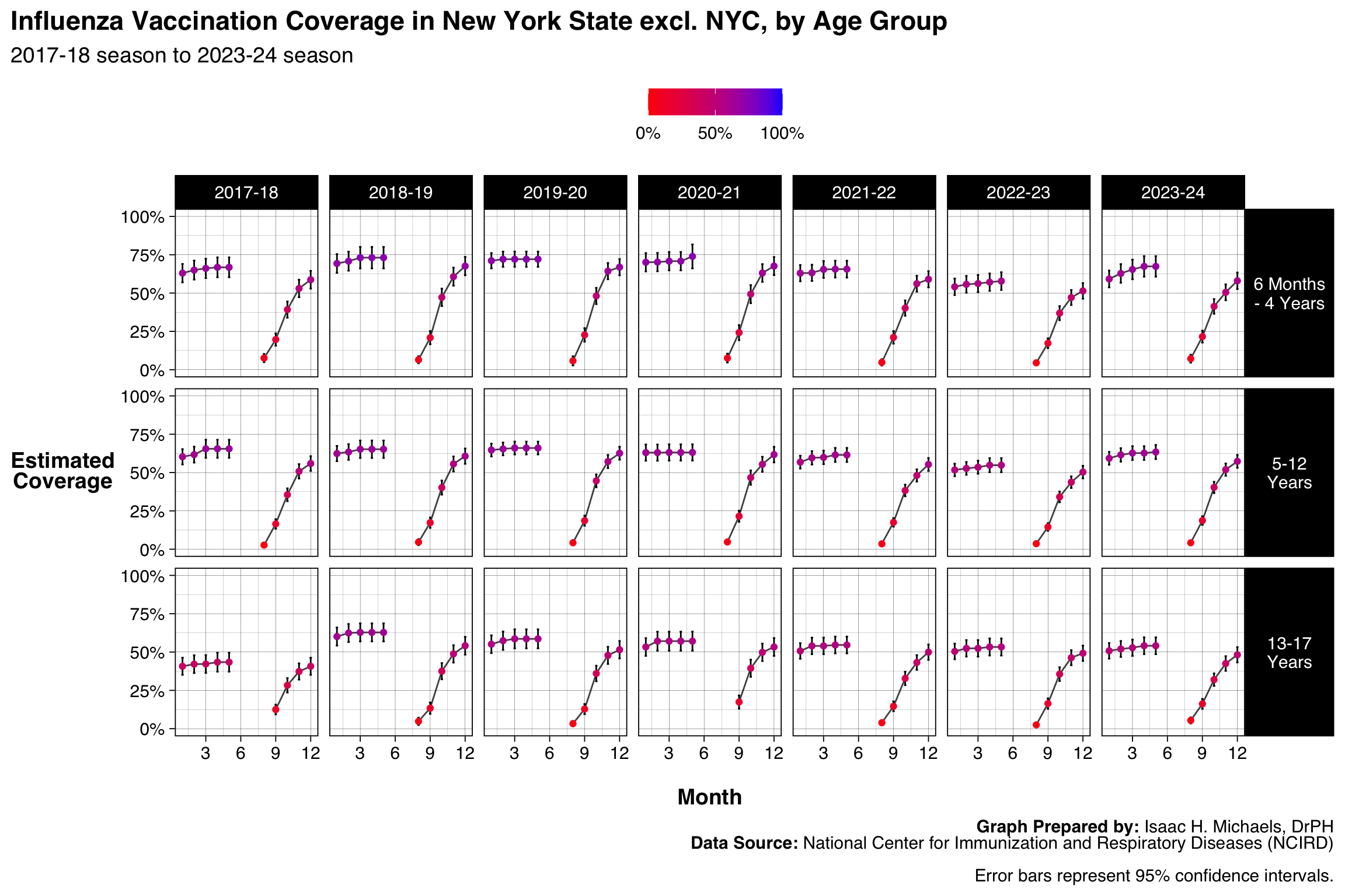 Graph Prepared By: Isaac H. Michaels, DrPH
Data Source: National Center for Immunization and Respiratory Diseases (NCIRD)
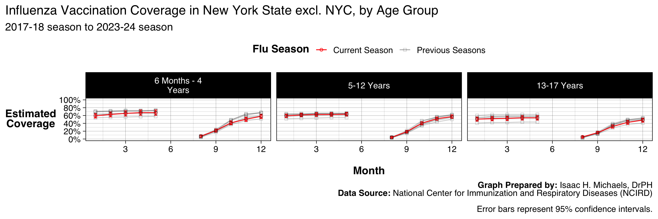
__Graph Prepared By:__ [Isaac H. Michaels, DrPH](https://www.researchgate.net/profile/Isaac_Michaels) Data Source: National Center for Immunization and Respiratory Diseases (NCIRD)
This executive summary was generated by an AI summarizer agent and reviewed by an editor agent. I review any summaries flagged for revision.↩︎